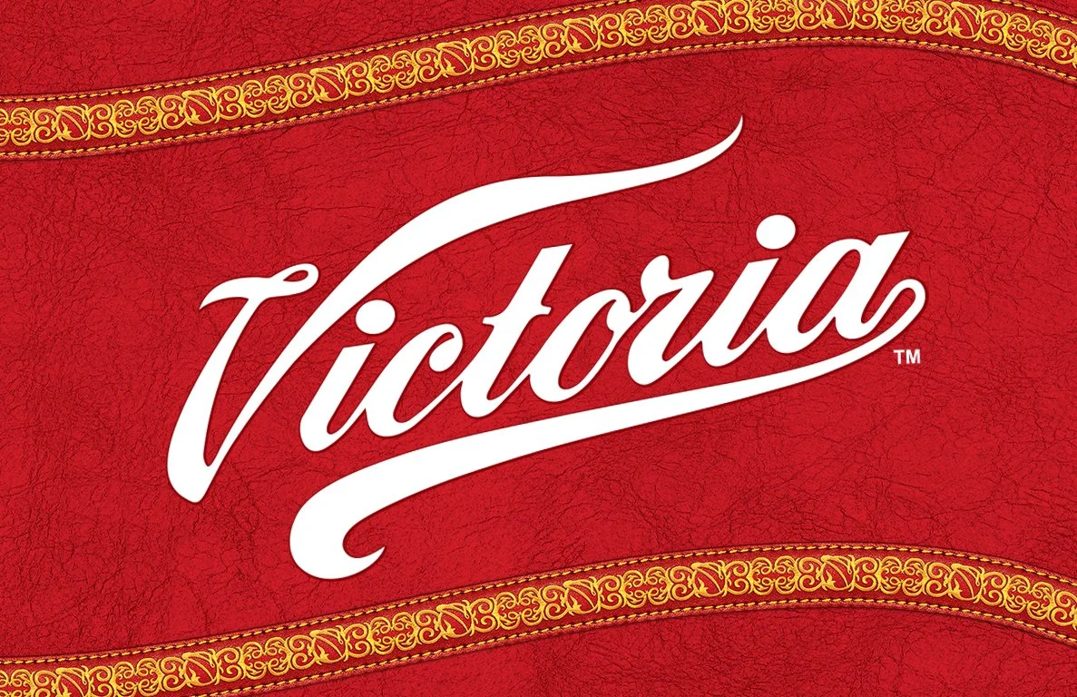
Victoria wanted to rediscover it's traditional mexican roots by pulling inspiration from the iconic Charro, the traditional mexican horseman. Through their uniquely patterned clothing and tools of the trade, I was able pull through a variety of new brand assets used across both digital and P.O.S materials.
Victoria Beer “Charro”
Inspired Re-design


A new typeface I developed specifically for the brand to match its redevelopment. Based on a more traditional serif style so each character could match the curves from the charro pattern designs.
All-New Font


How it comes together
Along with each new design coming together seamlessly, we were able to influence client to explore photography that better reflected their target audience.
